

Above all things in an e-commerce business, establishing a credible brand is essential. You want anyone who visits your e-commerce site to feel welcome, safe, and excited at the prospect of purchasing something from your online store. By establishing your business’s trustworthiness through high-quality branding and content, consumers will, in turn, feel compelled to peruse the product pages of your site.
With this in mind, you need to think about how the quality of your product pages affects the experience—they’re the direct gateway to checkout, so there’s very little room for error here. If you are not carving out time to review your website to ensure customers get what they want when visiting your product pages, then now is the time to do so.
Below, you will find 7 product page elements to review if you want to improve the user experience and your conversion rate.
1. Product Visuals
The critical thing to remember when designing a product page is to focus on the product, not on a fancy background design or distracting animation. By keeping the design of the page simple and clear, your customers can more easily focus on the photos and videos of your products.
Product images should be:
- High-resolution
- High-quality (i.e. professional-grade)
- Comprehensive, offering product views from different angles and in different colors, sizes and shapes
- Able to show customers a zoomed-in look at the details of the product
Product videos, on the other hand, get more into demonstrating how a product works. Use these e-commerce video marketing tips to help you determine the best way to use video.
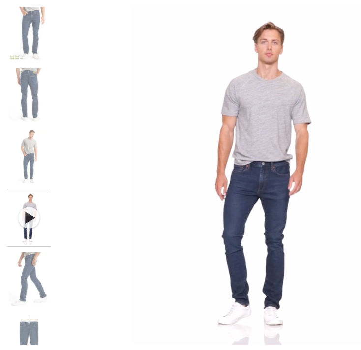
Gap is an example of one company providing video, along with multiple images, on its product pages:
2. Product Description
The visuals of your products are essential, but so are the words you use to describe them. This means taking the time to find the perfect wording for:
- Product titles
- Product descriptions and features
- Any keywords included in the text
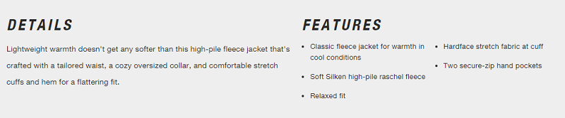
You want to aim for emotionally-charged language that triggers a specific reaction. You also want to make it quick and easy for shoppers to learn about your product, so don’t go overboard with the word count. The North Face breaks down the product description for one of its fleece jackets into “Details” and “Features,” neither of which are too wordy:
Also remember to be careful with the information you share about products, as poor or inaccurate descriptions could hurt sales.
3. Product Specifications
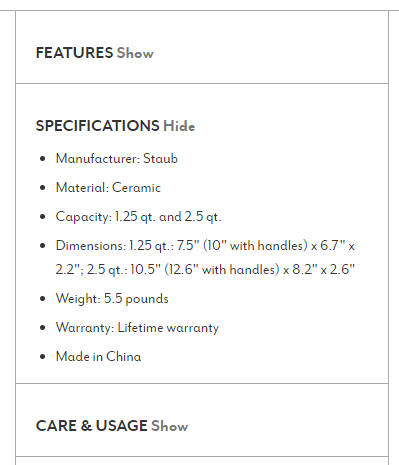
In the spirit of keeping things clear and concise, keep your product specifications separate from your product descriptions. Think about what details a shopper wants to know about—depending on the product, this could include anything from product dimensions to materials used. See below for the product specifications Sur La Table provides for a set of baking dishes:
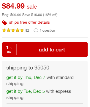
4. Product Pricing
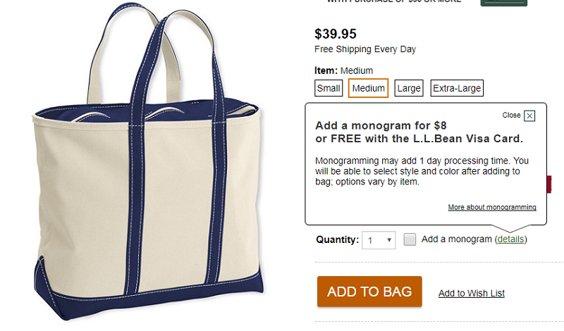
This might seem obvious, but make sure product pricing is easy to locate. If the price of a product changes by color, size or other factor like personalization, be sure make that clear, too. Here’s how L.L.Bean does it:
This would also be an excellent place to share real-time inventory information. By letting customers know how much of the product currently remains available at that price, you will indirectly motivate customers to buy it before it goes out of stock.
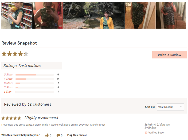
5. User-Generated Content
Any kind of user-generated content would be a helpful and welcome addition to your product pages. It comes in a variety of forms, including customer-submitted photos or videos, testimonials, reviews or ratings, and so on. Modcloth includes customer photos, ratings and reviews on its product pages:
6. “Buy” Button
Don’t add unnecessary confusion to your product pages. Use one and only one call-to-action (CTA): a “buy” button.
Regarding design of your CTA, keep in mind the following:
- Place the button in an obvious spot, preferably above the fold (don’t make the customer scroll down to find it) and on the right side of the page.
- Use a positive and attention-grabbing color.
- Rely on a strong and easy-to-read font.
- Keep the message simple—“Buy Now,” “Add to Cart,” Add to Bag”
7. Shipping and Delivery
In the spirit of a simple and surprise-free shopping process, make sure your shipping details are easy to locate from a product page. Ideally, this information will go near the checkout CTA, which is how Target does it:
This ensures that customers understand the policy before encountering unexpected terms, fees, or turnaround times at checkout.
When was the last time you took a look at your product pages? If it has been awhile and you are not satisfied with your conversion rate, then now is the time to conduct a product page audit and give your design a boost.
About Endicia
Endicia is a leading provider of internet-based postage services that make it easier and more affordable to ship parcels through the U.S. Postal Service®. We know that shipping can be complex and our goal is to simplify your shipping operations so you can focus on doing what you do best. Visit us at endicia.com to learn more.