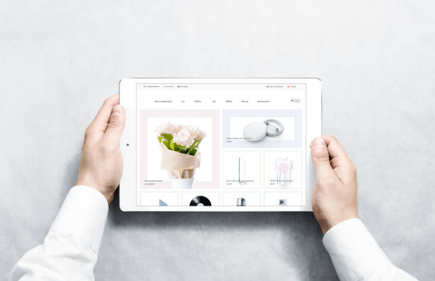
When it comes to your ecommerce website, there’s a big difference between visitors and customers. You’ve done all the research and work needed to drive traffic to your site, but what do people see when they get there? Now isn’t the time to just sit back and hope for the best.
Your product pages are where the rubber meets the road. The user experience at this point will determine whether a visitor turns into a customer or clicks away to some other sector of cyberspace. So here are some tips for creating high-converting product pages.
Not All Pictures Are Created Equal
While your pages undoubtedly have pictures of your products, what kind of pictures are they? Do they present your products in the best light — both figuratively and literally? Large, crisp, high-quality photos will make visitors stop and look. Options to zoom in and get a 360-degree view make it even better. Because visitors can’t pick up the product and hold it, they rely on the pictures you provide to make an assessment. Money spent on professional photography is one of the best investments you can make.
Create Enticing Content
Two things are important here: Know your product and know your customers. Don’t assume that potential buyers already know all about the products you sell. You have to present them to your customers without resorting to boring manufacturers’ descriptions. Strike a balance with detail, humor, and conversational tone in your content. Be creative and unique with the text you write, but don’t let style overshadow substance. Make your product descriptions both informative and enjoyable to read. Create your own “voice” and use it consistently throughout your descriptions.
Does your product come in different styles, colors, sizes, etc.? If so, it should be easy for visitors to see the choices they have. Side-by-side photos or drop-down menus allow potential customers to quickly navigate through all of their options.
Optimize for Mobile
More than half of all ecommerce purchases are made on a mobile device. How mobile-friendly ae your product pages when they are accessed on a phone or tablet? Visitors will quickly click away if the site is difficult to navigate. Be sure the user experience on a mobile device is easy and seamless.
Strike While the Iron Is Hot
A visitor to your website may be looking for just one product, but don’t waste the opportunity to show them what else you have. If a potential customer is looking at a phone, they might also be interested in a charging dock, case, headphones, or SD card. If it’s a dress, what about shoes, undergarments or a handbag? Showing related items on a product page is a great way to increase sales. “You might also like” or “Customers also bought” are effective ways to showcase some of your other products.
Give Your Customers a Voice
Even if you have a sizeable marketing and advertising budget, in reality, your satisfied customers are your best sales agents. So give them a voice. Many people read customer reviews when considering a purchase, so make sure your product pages feature them. They build trust and confidence, and they may be the very thing that convinces a visitor to click “Add to cart.”


